Week 16 Uni-Lateral Arbiter
Multiple "Games of the Year", some sneaky-solid matchups, and a return of mono below the neck. Yeck
This week felt very important to a lot of teams. If both teams in the game weren’t already eliminated, it felt like a playoff atmosphere already in most stadiums this week. It’s a very intense season so far, and I can’t wait for the playoffs. It’ll be a fun time.
The uniforms this week were pretty decent. Nothing absolutely outstanding like the double gorgeous game last Thursday night, but a lot of solid 7.5/10 games. And sometimes, that’s all we can ask for in the NFL.
We started the week off with the penultimate Rivalries unveiling. It was definitely a Rivalries uniform, in every sense of the word. Overall it should have been forgettable; however, the quality of game in which the uniforms were won make that an impossibility… Off to it!
Seahawks 38, Rams 37
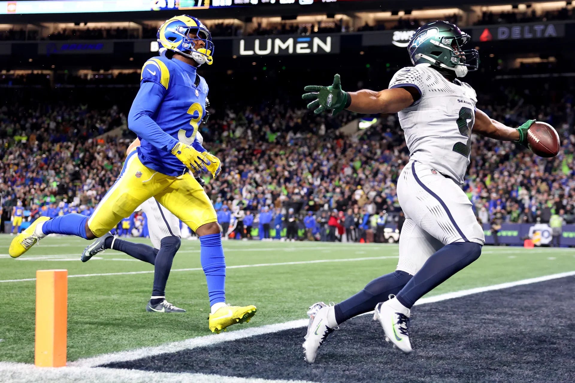
The game of the season may have occurred on Thursday night. It was absolutely insane, because the Seahawks had literally never made a comeback from down 15+ points in the 4th quarter, going 0-172 before this game in that scenario. It seemed that there was no way this game was going to go right for Seattle, however, after a certain point (after Sam Darnold threw his second pick) that I decided to stop watching this game. There was just no way the Hawks could come back.
I went upstairs and took a sad, mopey shower. I was thinking about how sucky it was to play that badly in prime time, how the Rams are stupid and I hate but respect Sean McVay, how Lumen Field just doesn’t have the home field advantage it should, but, most importantly for this column, how I was so glad we had such a bad game in these stupid uniforms, so we’d never have to see them again.
Oh how wrong I was. As I was going down the stairs to get into bed, I checked my phone one last time. ESPN says it’s tied. TIED?! I turned it on as they were going into overtime. I watched as the Rams predictably went to Puka the entire overtime drive, but then Seattle got it back and started driving. I was waiting for the inevitable Sam Darnold turnover, but it never came! JSN touchdown in the back of the end zone to give them a chance, and Eric Saubert of all people to win the game?!? Are you kidding me?! I scared my wife celebrating at 11:45, but what an incredible ending.
The problem with the ending, however, is the fact that it makes the Seahawks’ Rivalries uniform iconic in a good way. The jersey was immediately sold out online after the game, so people are excited to show support for these unis. That’s quite unfortunate, because the jersey is the worst part of this uniform set, by far.
The helmet itself for Seattle is honestly really cool. It’s a gimmick, but for a one-time-a-year Rivalries uniform game, it’s fine. The iridescent-ness was definitely evident throughout the broadcast, and it made for a nice sheen. The Seahawk logo on the side was washed out in some shots, but that’s not the star of the helmet.
The jersey itself is a mess. The iridescent-ness of the numbers were blinding and distracting in some shots, and looked more brown than anything else. The shoulders exhibited “sound waves” with even more shininess. No numbers on the shoulders at all made things slightly confusing in far-away shots.
I did like the fact that they have their regular navy socks, to break up the gray mono look. It could have been a really bad set had Nike gone mono-gray.
For their sake, the Rams wore their Sunday Best on Thursday, which was interesting to see in Seattle. If anything, the brightness from LA’s set accentuated how dull the Seahawk’s set was at night. I would have loved to have seen this in a late afternoon game to see the sun setting on the iridescent domes. As it stood in the rain, it was not a good look. Gray on Seattle’s already dull turf is quite drab.
Overall, I would have been fine with this being a one and done uniform for Seattle. That being said, if this iconic finish is going to linger in people’s minds, then tweak some things. Keep the helmets. Just fix the numbers and get rid of the shoulder waves. Those are dumb and don’t need to exist.
Grade: Try Again
Eagles 29, Commanders 18
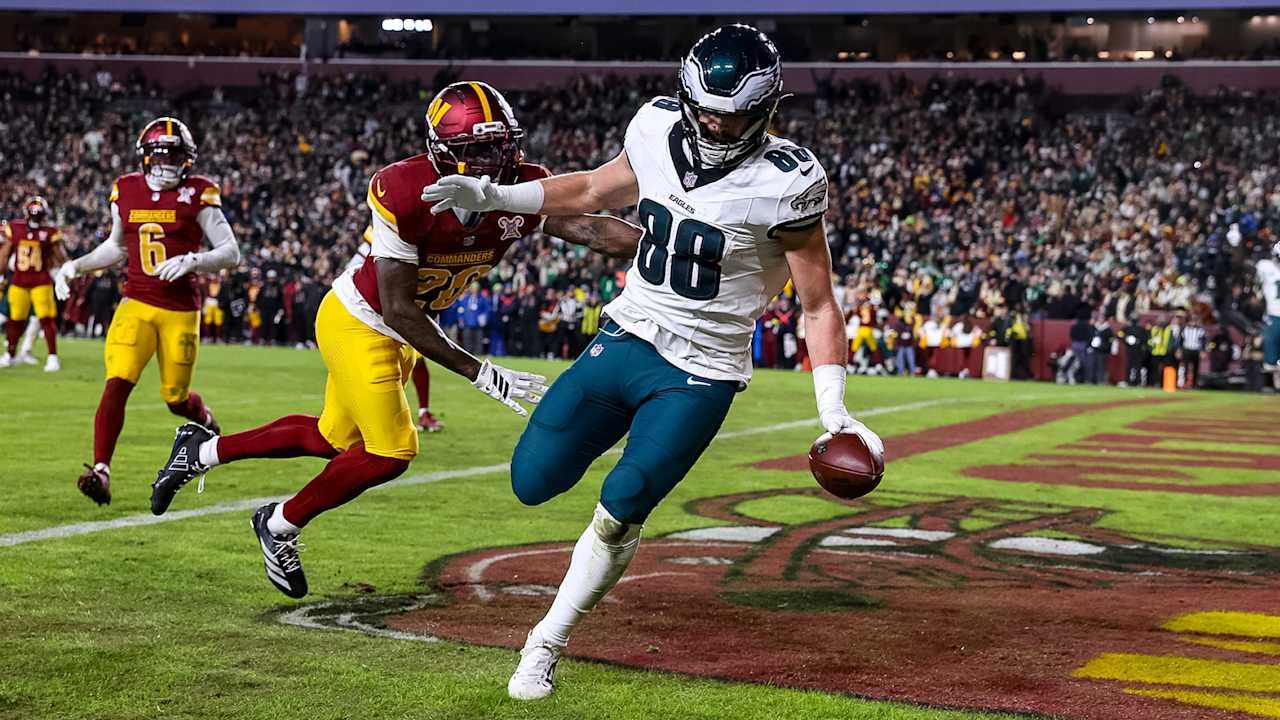
The first Saturday game of the weekend was a pleasant-looking divisional matchup. It was not a pleasantly-played game, as it got chippy early and often.
Both teams wore very nice uniform combos. It was almost a full Color Palate Special, wherein each team wears different non-white colors for each uniform element. For example, had the Eagles worn black socks, it would have made for an entirely different color game for a full Color Palate Special.
Overall, I’m always glad when Washington wears yellow pants. It looks so much better, and while I’m ready for them to reintroduce their burgundy pants with the stripes from their Super Bowl-era throwbacks, I’d be perfectly fine with them keeping these pants.
Grade: Quite Solid
Bears 22, Packers 16
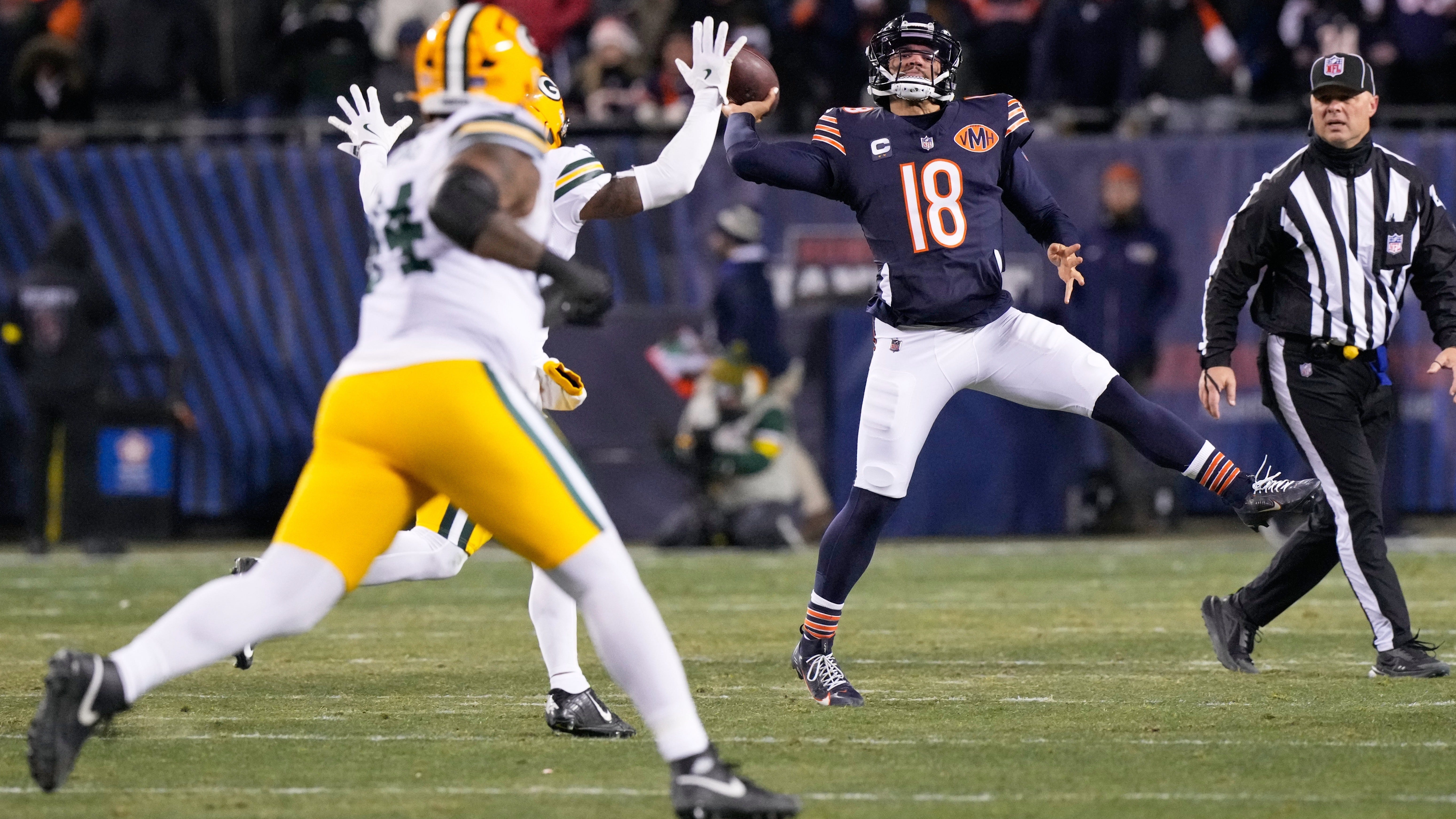
The late Saturday night divisional game had all the excitement from Thursday, with mostly traditional uniforms. For some reason, the Packers made the inexplicable move to go with white socks over their traditional green.
Does it look better to them at night? Do they want to intentionally look checker-boarded? And I’ll admit, I usually love this matching helmet/pants, jersey/socks combo. However, when you’re a traditional team like the Packers and have a green sock combination in rotation and it’s better than this look in every way, why bother going away from it?
The Bears have been doing great this whole season. I’m excited to see these beauties in the postseason, possibly in Soldier Field in January.
Grade: Quite Solid (could’ve been Absolutely Gorgeous with green socks….)
Panthers 23, Buccaneers 20
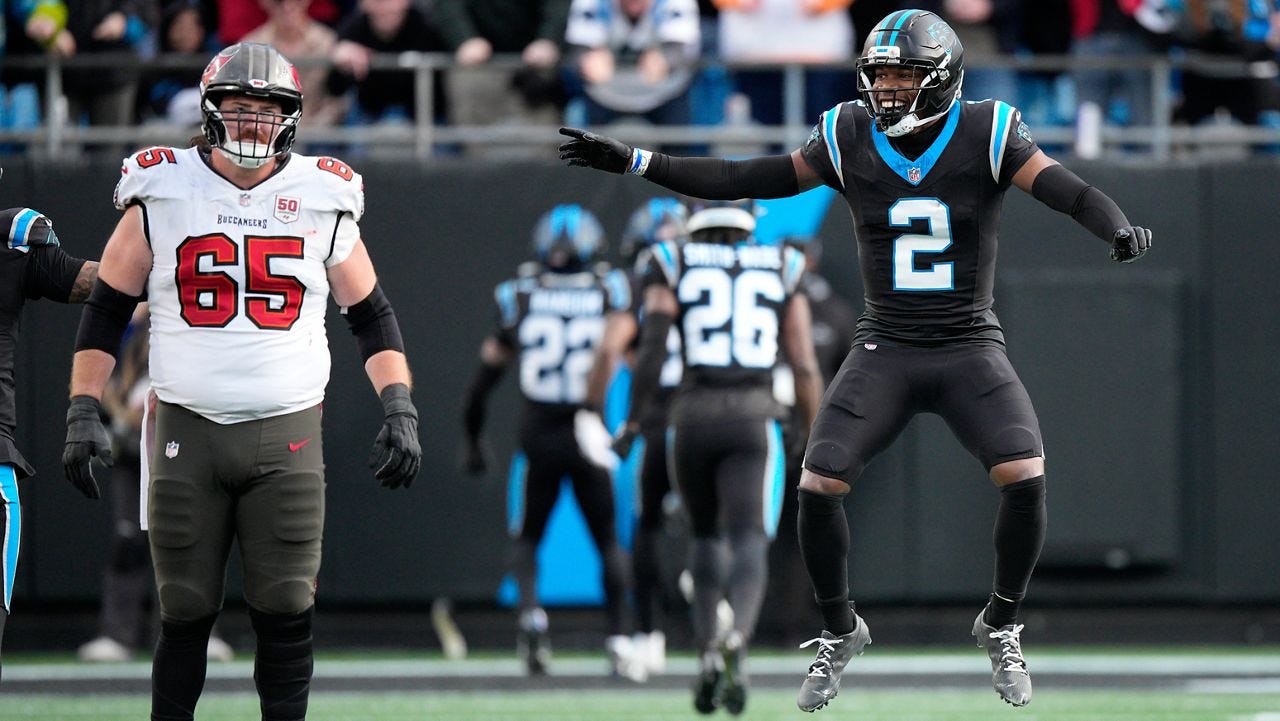
In yet another divisional matchup this weekend, the Panthers got a huge leg up by beating Tampa Bay in Charlotte. Their all-black uniforms gave them a leg up, which I understand is strange of me to say. Hear me out…
The Panthers should be a black team. Their logo is a black panther. They need to channel serious panther energy if they want to survive and get to the playoffs. These mono-blacks do exactly that. Everything looks much more cohesive in the mono-black for Carolina than it should, but they look good.
The Bucs looked fine, but unless they were going to go with white pants, they weren’t going to look great against the mono-black. It’s not bad, but it’s definitely not a super cohesive looking game.
Grade: Meh
Buffalo 23, Cleveland 20
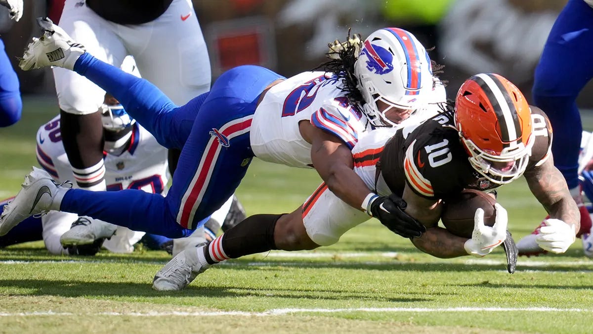
The Battle of Lake Erie ended with the visitors victorious. Buffalo’s preferred white/white/blue/blue is balanced in its own way, and I’ve come around to liking this look on them.
Cleveland’s home orange/brown/white/brown is a classic for a reason. I love orange pants as well, but this a very close second. Always good to see sock stripes, even if they’re the tiniest of stripes to be compliant.
Grade: Absolutely Gorgeous
Chargers 34, Cowboys 17
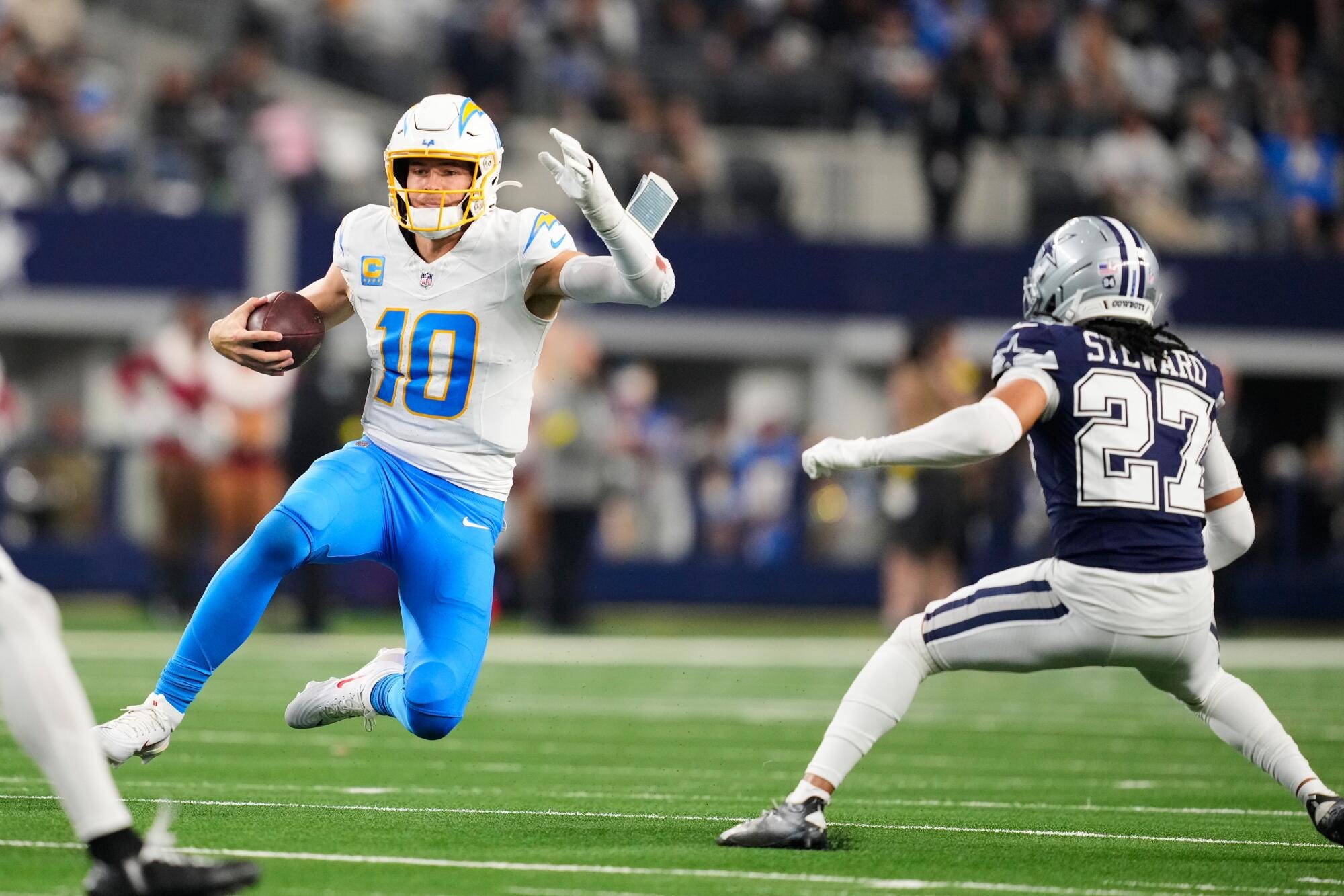
The Cowboys surprised me with yet another game in blue; this is their 3rd out of 4 weeks wearing blue, and they have already announced they will be wearing blue next week, making it 4 out of 5 weeks after only wearing white for the first 11 games.
In the context of the Cowboys in silver/navy/white/white, LA countered with a very nice mono blue below the waist. I would have liked to have seen yellow pants here to add some pop, because there was a lot of blue in this game.
Not a bad looking game by any means, but I think the sum didn’t equal the whole of its parts here.
Grade: Good-ish
Saints 29, Jets 6
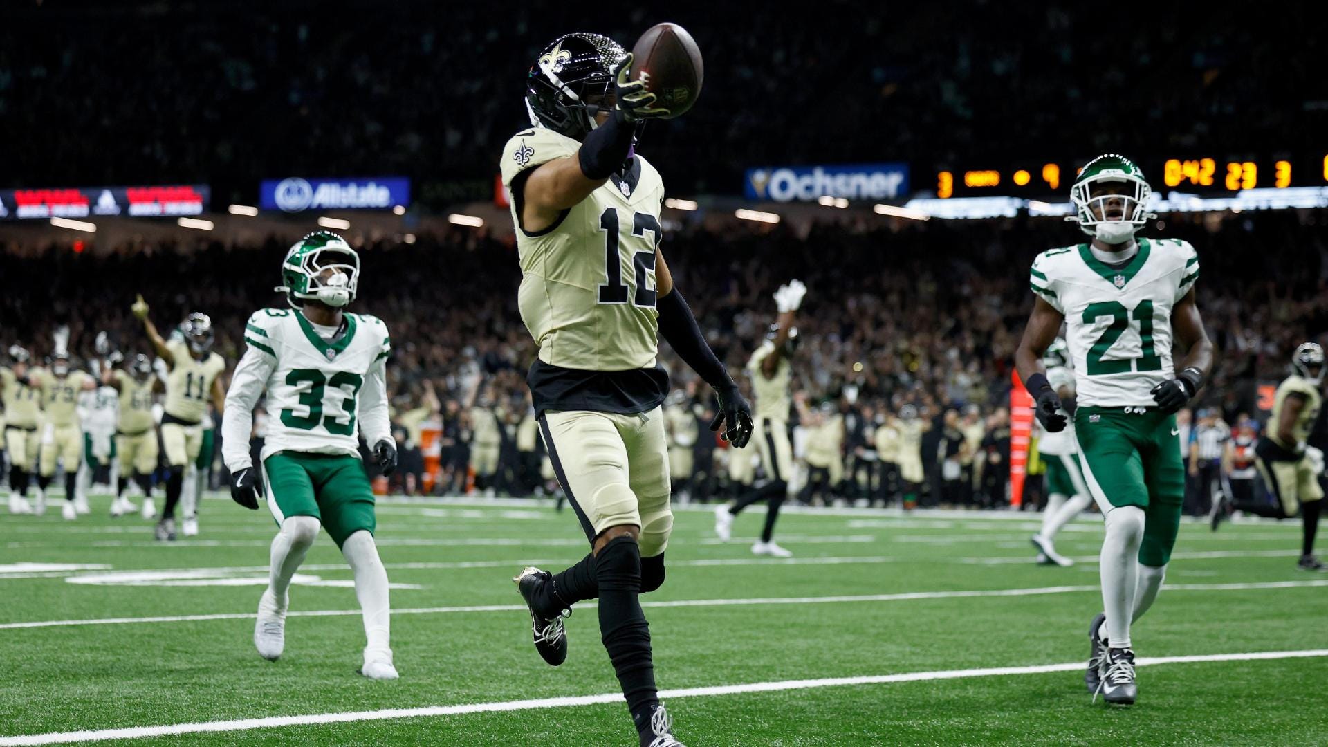
Wow. The Saints pulled out an all-new look, going with black/gold/gold/black in the Superdome. New Orleans hadn’t paired the gold pants with the gold jersey yet. I say “gold” loosely, as this is more tan than anything else, but I digress.
The Jets wore their best away look, but unfortunately, it didn’t pair well with the Saints’ look. The green and tan-ish gold clashed too much, but I appreciated the effort.
I didn’t like this matchup, but I loved the Saints trying something new. This look lightened up the Superdome so much, and I was very glad to see them willing to experiment. I’d love to see this be the basis of any new uniform template for the Saints moving forward.
Grade: Good-ish
Vikings 16, Giants 13
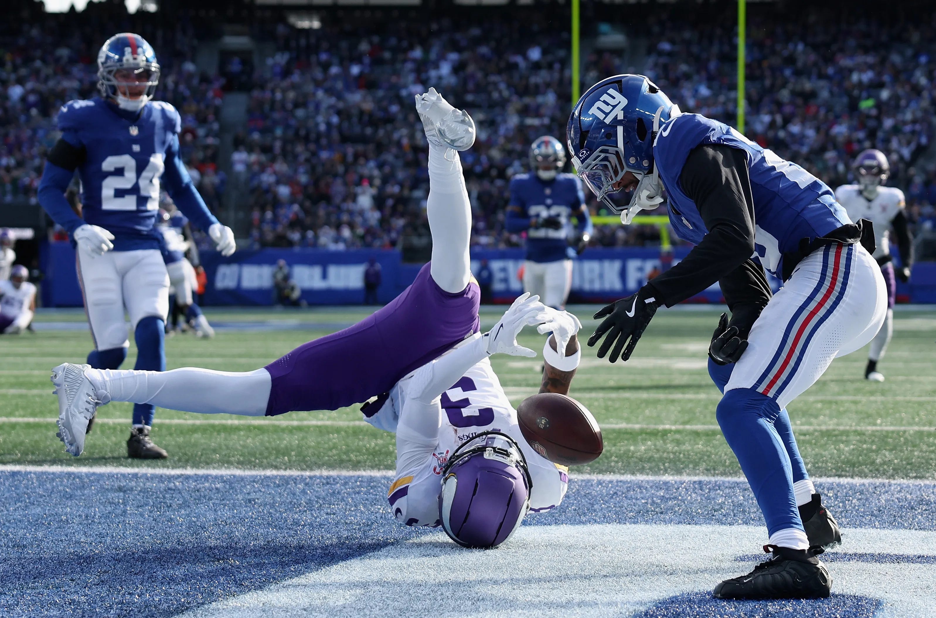
I was shocked by how much I enjoyed this matchup. The purple and blue of each team is slightly too close on the color wheel, and had forced me to take a half-second longer to tell who was who on the field.
However, that being said, I loved it. The Vikings went with the checkerboard look, finally wearing white socks with purple pants. Great! New York’s home look is perfect, and complimented the Vikings’ white socks well.
Grade: Absolutely Gorgeous
Titans 26, Chiefs 9
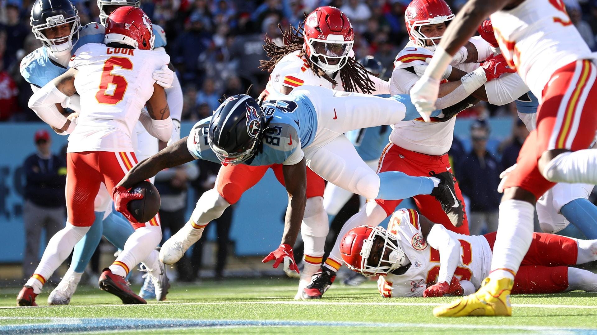
I can’t believe I’m saying this about a Tennessee Titans game, but I LOVED this game. The Chiefs were always bound to look good, with plenty of red and yellow accents. The Titans’ preferred home look this year perfectly complimented Kansas City, and made me forget about the Titans’ ridiculous number fonts.
But seriously! Look at this! Red and blue is such a classic rivalry color, and even if these teams aren’t actually rivals in real life, their colors tickled my fancy. Balanced, clean looks by both teams. I love it.
Grade: Absolutely Gorgeous
Bengals 45, Dolphins 21
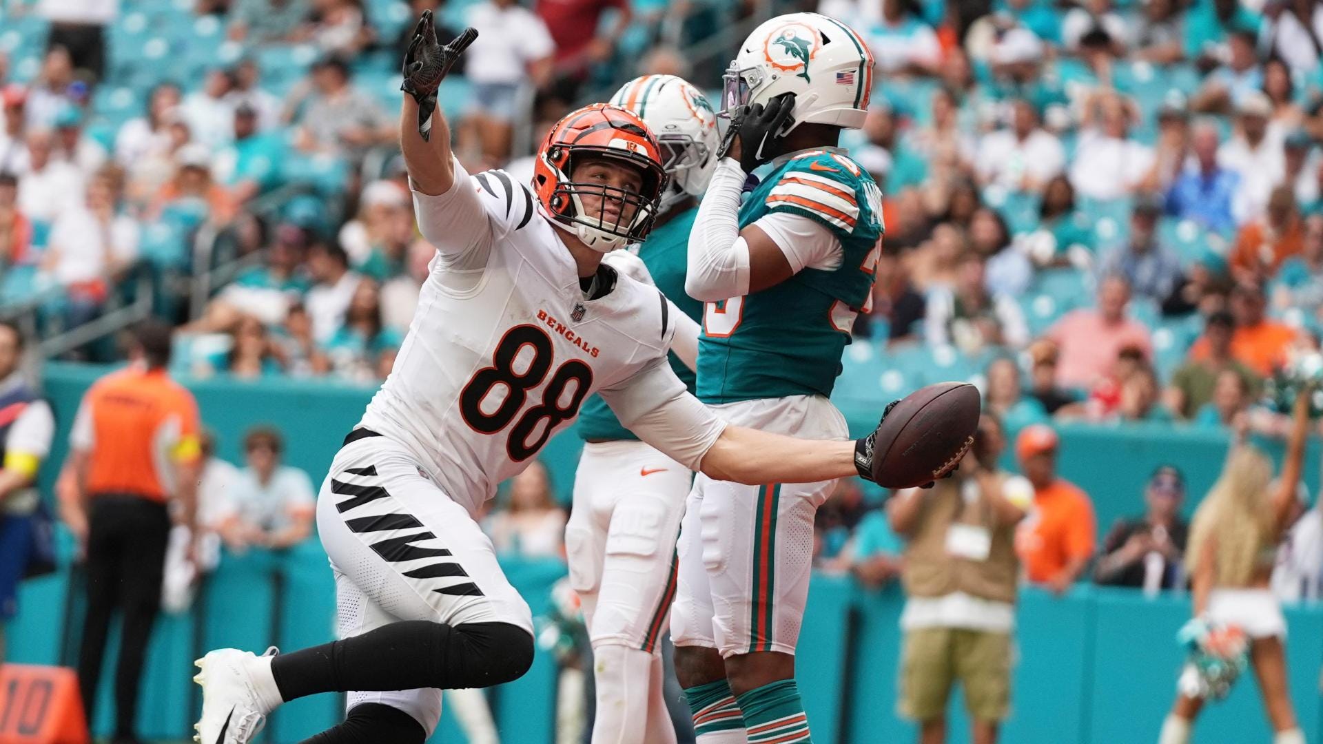
The Dolphins are a strange case to me: why in the world would they break out their best uniform in their entire set - their Dan Marino-era uniforms - when they’re already eliminated and the team feels defeated? Miami seemed to have given up, and turning to Quinn Ewers really cemented that fact.
At least Miami looked good in the loss. These would look so great under the lights in those early October night games in Miami this team always seems to get. However, they’ll continue to use a bland and un-fun uniform set until their owner says so.
Cincy looked great as always in their orange/white/white/black set. It didn’t quite compliment Miami’s throwbacks well enough, but it still looked good.
Grade: Quite Solid
Falcons 26, Cardinals 19
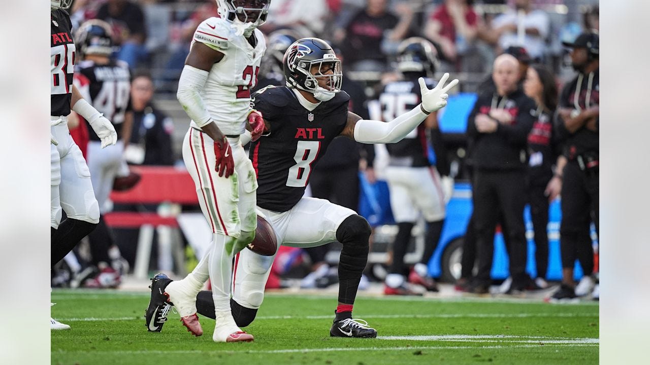
The Cardinals wore their all-white uniforms at home, which is actually their best combo that they wear. It was a good look, especially when complimented with the Falcons in their best non-throwback look. Both teams have bad uniform sets overall, but each of these specific combos could be useful.
Atlanta seems to be already moving on from this uniform set, getting ready to unveil new uniforms inspired by throwbacks. Everyone is excited for that.
Grade: Good-ish
Lions 24, Steelers 29
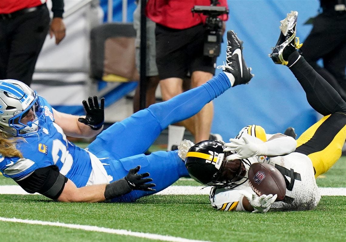
This matchup was definitely a vibrant one, especially in Ford Field. The Lions returned to their “Blueberries”, much to the chagrin of those who enjoy silver pants. It’s not a bad look, and it’s much better than the all-white look, but it could be so much better with a bit of silver to break of the monotony of blue.
The Steelers look great as always, and their yellow pants really popped under the lights. It complimented the uniforms of Detroit, as well as the bright blue end zones. It was a nice looking game.
Grade: Quite Solid
Jaguars 34, Broncos 20
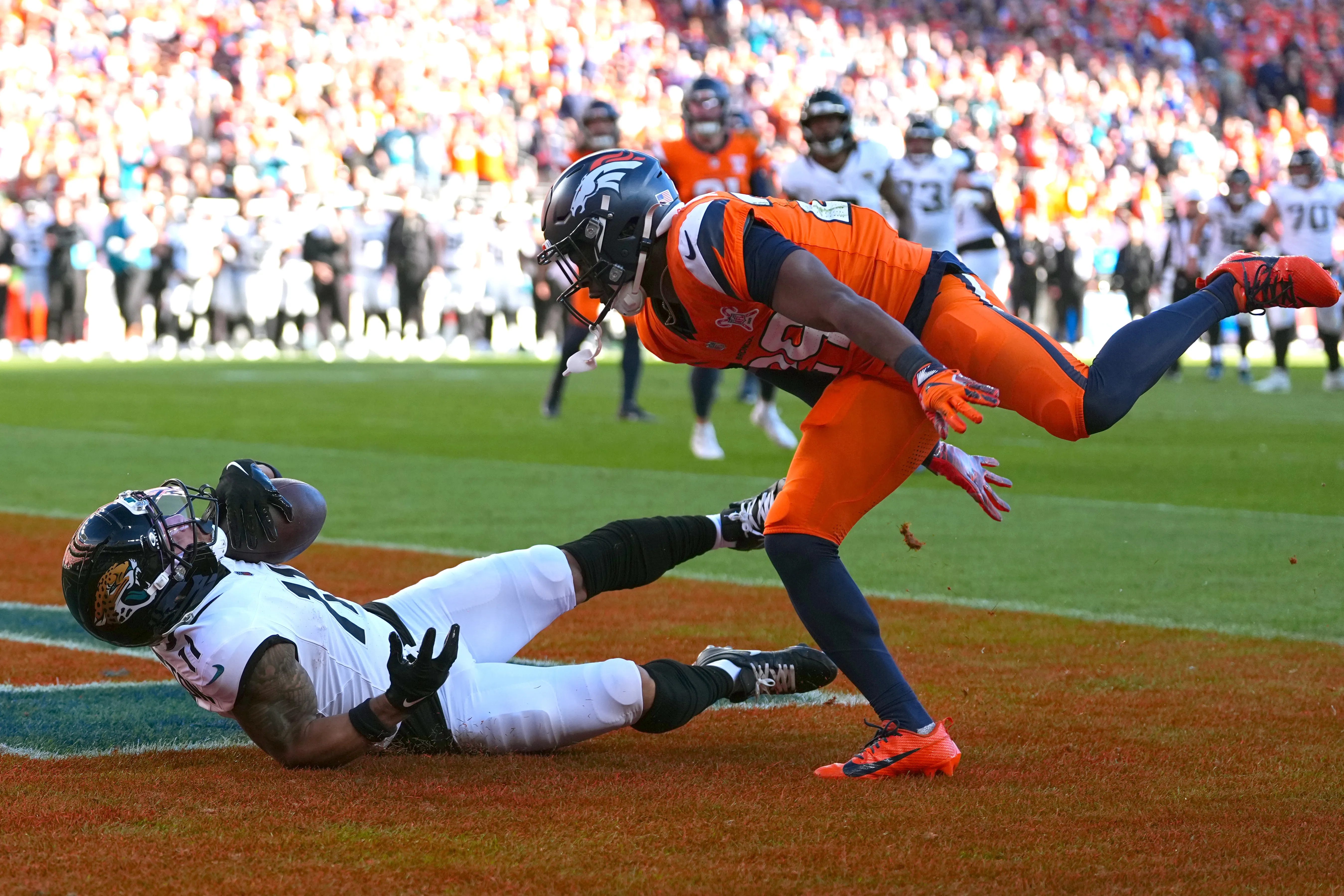
The sneaky biggest game of the week in the AFC was not a bad-looking game. It was a very opposite-heavy game in Denver; the Broncos’ navy/orange/orange/navy clashed with Jacksonville’s black/white/white/black. Nothing too bad, but Denver felt sluggish. There were a few too many dark elements in their combo, and Jacksonville didn’t do a good job of differentiating.
I would have loved to see Jacksonville in teal pants and Denver in white pants. That would have been an incredible visual, but this was just a mediocre matchup.
Grade: Meh
Texans 23, Raiders 21
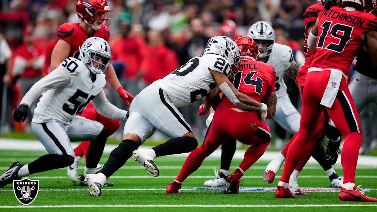
Gross. Phooey. The only pass I give Houston is the fact that it’s the Christmas season, and that peppermint candy is in style. But otherwise, whoof. That was just not a good uniform. I have stated my opinions on these monstrosities before, in the Week 12 Uni-Lateral Arbiter, but the gist is this; the horns on the helmet and the shoulders of the jersey don’t make sense, the helmet is way too shiny and bright, and the red is too aggressive. This is not a uniform that needs to exist.
The Raiders did their job in their primary away uniforms, but there was nothing they could do against those candy-heads.
Grade: Groady
Ravens 24, Patriots 28
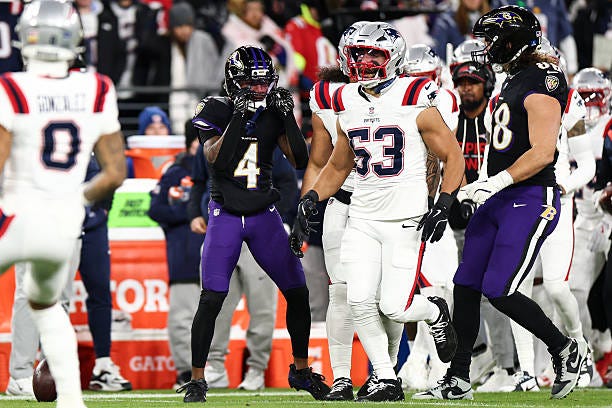
A new look to a modern rivalry; the Ravens took on the Patriots by going black/black/purple/black. New England countered in mono-white below the neck. I don’t mind the Patriots in mono white as much as I should, but it’s not a bad look. It’s definitely not as good as it could be, and they should be in silver pants, but I don’t have the mono-white.
Baltimore’s look fits for M&T Bank Stadium in December. The Ravens always seem to break out the black jerseys in December, and pairing it up with the purple pants is a great way to wear it. The menacing black jersey is accentuated even more so with the pop of purple.
Grade: Quite Solid
Week 16 in the books. Only 2 more to go. Playoff picture starting to come together. I love this time of year, because it basically becomes a playoff game every step of the way for some teams.
Let me know your thoughts in the comments down below. Do you agree with my take about the Seahawks’ Rivalries uniforms? What’s the “worst” iconic uniform in your team’s history, and why? I’m open to any and all comments/suggestions, so let me hear it!
I’m excited to see Philip Rivers on national TV tomorrow. It’s a shame he’s wearing the pajama-textured “Indiana Nights” uniform, but it’ll still be a good viewing experience to see how he rocks it. I’m rooting for him.
See ya next week!
This rundown is worthy of a comment.
Nice work!
Seahawks rivalry:
Ok, but unnecessary.