Week 13 Uni-lateral Arbiter
Thanksgiving week in the NFL had me giving thanks to the teams who wore their Sunday Best, and side-eyeing the turkeys who didn't take their dressing seriously.
I hope everyone had a great Thanksgiving weekend with friends and family. It was an “almost” weekend for a lot of reasons; I “almost” didn’t eat too much, I “almost” worked out, and there were “almost” a lot of good uniform matchups this week. Too many teams randomly decided to punt on an Absolutely Gorgeous matchup for random white uniform elements. We had a lot of soggy and rainy games, but it almost felt like we had plenty of snow games with how much white was on the field in a few matchups. That trend started with the first game of the week, before I had even started digging into my turkey…
Packers 31, Lions 24
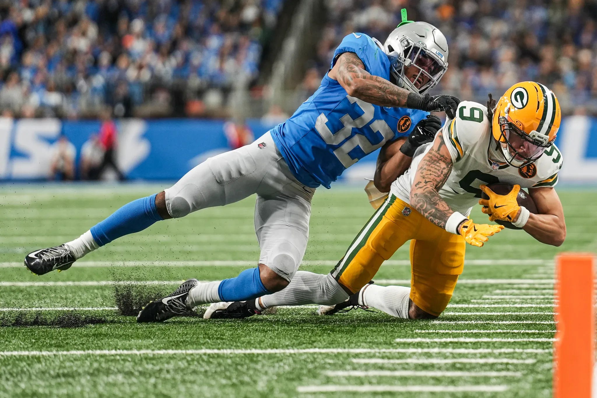
The first Thanksgiving Day game of the weekend brought the return of the Lions throwback uniform. For superstitious reasons, Detroit did not wear their 1950’s throwbacks at all last year, but brought them back for the turkey day game this year. It may not have been a good choice, as the team broke a 7-year Thanksgiving losing streak last year in the “blueberries”, but lost this year after dusting off the throwbacks… For superstitious purposes, Detroit may want to leave these threads in the locker, but for aesthetic purposes, I surely hope they don’t.
The all-clean silver/blue/silver/blue is a very nice Thanksgiving tradition. It’s simple, but nostalgic. It’s reliability you can expect on Thanksgiving, like grandma’s pumpkin pie, an uncle pulling a hamstring in the flag football game, and a cousin making an off-color political joke. This is the perfect throwback in my opinion; simple yet identifiable, respectful yet sharp. Some throwbacks try to do too much, or look completely different from their main identity. Detroit’s unis are perfect for the once-a-season, pre-Thanksgiving dinner game.
On Green Bay’s side, I will never understand why they choose to go with white socks when green are readily available. This game would have been Absolutely Gorgeous had they chosen to go with green socks, but by going with white socks, the Packers completely watered-down their look. Too many light-colored uniform aspects that didn’t counteract the silver and light blue look from the Lions enough. Still a great looking game, it was just disappointing when the Packers were thisclose to being perfect.
Grade: Quite Solid
Cowboys 31, Chiefs 28
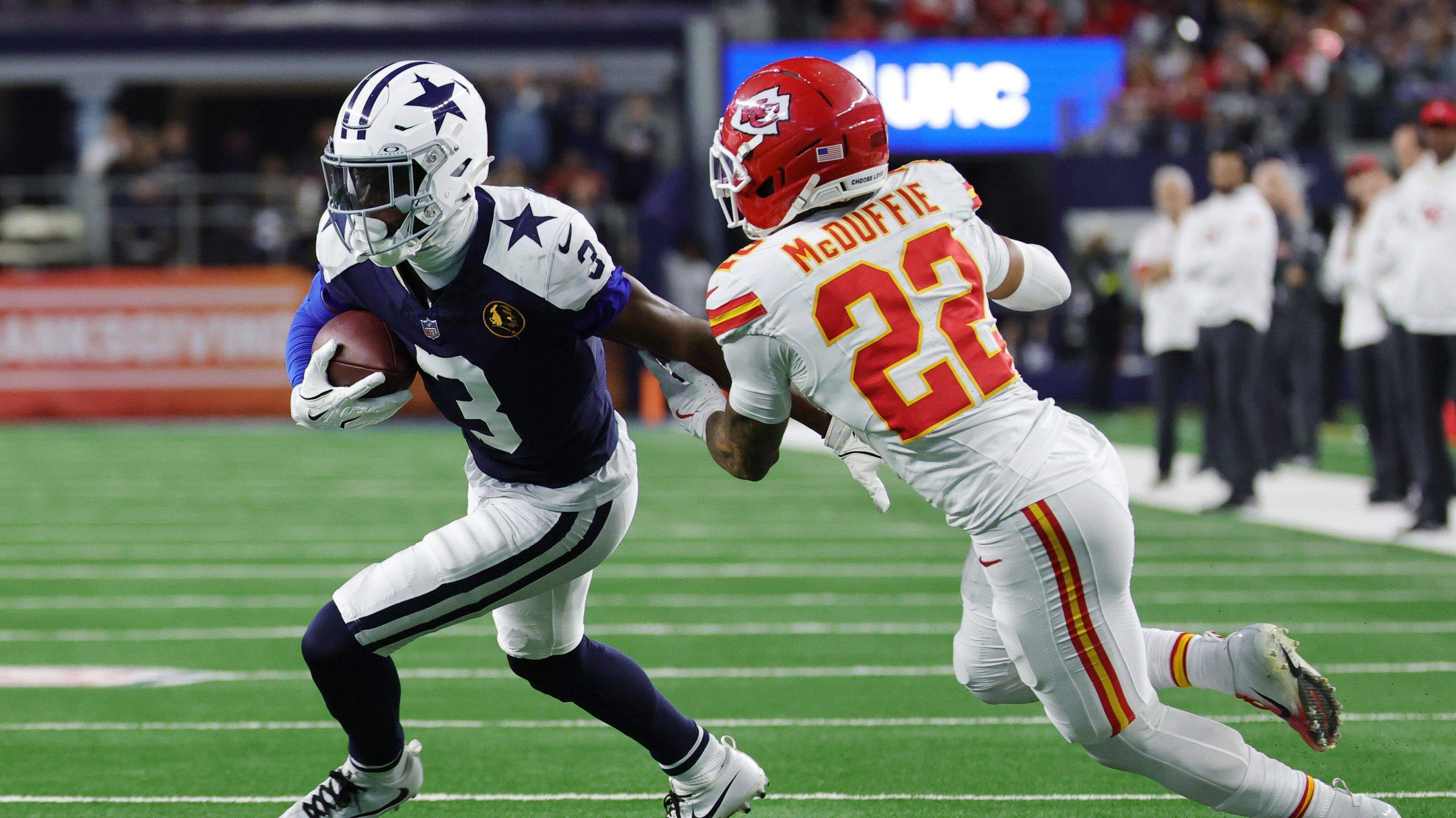
“Too much white.” That’s what my mom, dad, and wife all said before I even mentioned my opinion on this game. But yuck. Most games with more than 3 white elements out of the helmet/jersey/pants/socks combo is not a good one, but especially not when this game had 5.5 white elements (the white yoke on the Cowboys uniform is the .5).
While I appreciated the fact that the Cowboys wore their throwbacks in this game (going 4-0 in these on Thanksgiving in the past 4 years), the Chiefs killed me when they went mono-white below the neck. This game could have been one of the best looking games of the year if the Chiefs had worn their normal away uniforms with the red pants. Heck, if they would have worn even red socks with the white pants, it could have been pretty good. But to go with all white, in bright and sunny Dallas where the setting sun shines through the end of the stadium? Shame on you, Chiefs.
P.S. The Chiefs also had a sock-tastrophe. A limited few players wore their socks with the stripes along the calf, as they should. The vast majority of them had their stripes around their ankles. Strangely enough, Chamarri Conner had 3 sets of ankle stripes. That doesn’t seem to be a legal adaptation, but it’s at least a better look than most of Kansas City.
Grade: Meh (the Cowboys saved this from being a negative grade)
Bengals 32, Ravens 14
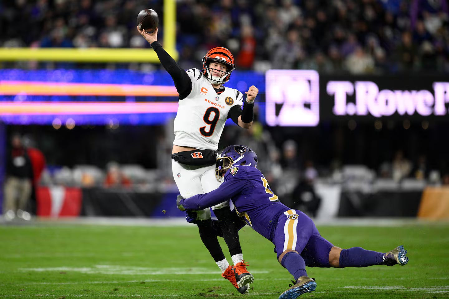
The Thanksgiving nightcap gave us a lot of purple; but honestly, I didn’t hate it. I know, I know, I can hear your boos from here. Hear me out…
The Ravens have a very strong identity as a black and purple team. Even before the one-shell helmet rule was dropped, they liked to go with their mono-black or purple below the neck. Now that they have a beautiful matte purple helmet (some may not like it, but that is a very regal shade of purple when paired with that gold facemask), the purple alternates for a huge divisional night game pops even better than black. To do it against the Bengals in their crisp whites and orange helmet makes it a great matchup.
Cincinnati always has good combinations. While I really like the orange pants, this is probably their second-best away uni combo they can make. The players can spice up this set by wearing both black and orange accessories, so it’s really fun to see how they each style themselves.
Grade: Quite Solid
Bears 24, Eagles 15
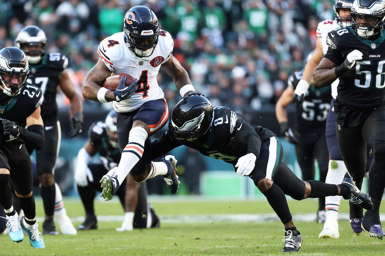
One week after being handed their first loss in the Kelly Green throwbacks, the Eagles got served up a Black Friday beatdown in their all-black uniforms. Since their debut in 2014, Philly’s black unis had had a staggering 17-5 record, and a 3-1 record including the black helmet… until this week.
For its credit, the black helmet makes this uniform combo look 10x better than with the regular midnight green helmet. But, the real question is, does it need to exist? No, not at all. It’s purely a black-for-black’s-sake (BFBS) uniform. It looks especially bad against the Bears, who look great as always, but have 2 dark navy elements. 6 out of the 8 elements being a very dark color does not lend itself to a very good grade.
Grade: Try Again
Dolphins 21, Saints 17
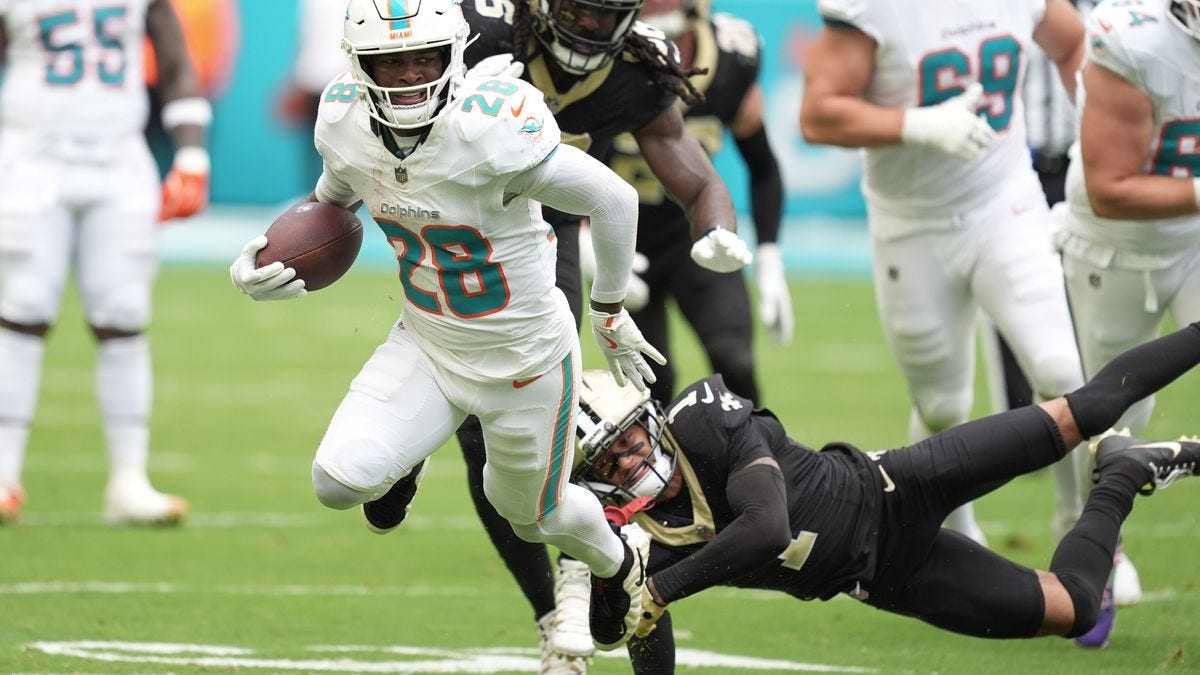
Pfffft. What a stinker. The Dolphins went with their mono-whites, where New Orleans wore all black below the neck. Normally by this time of year, Miami is wearing aqua at home, which is honestly a great look! But I guess it was still warm enough in South Beach that they would rather force their opponents to wear black. Whatever it was… it was gross and I never need to see it again.
The Dolphins are one of the few teams that can pull off the entirely white look, since they are Miami’s team, but that doesn’t mean they should. The Saints LOVE this look, but somehow it looks even worse outside in Miami than in the drab Superdome. If they burn these black pants, or at least add some sort of stripe, it could be saved. But until then…
Grade: Burn and Bury It
Texans 20, Colts 16
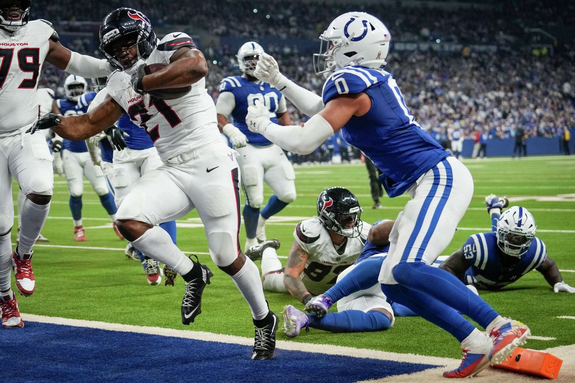
The Colts brought their Sunday Best to the field, but it was a shame their opponents didn’t. The Texans number font, inconsistencies from home to away jersey, and terrible alternates could all be overlooked if they did one simple thing right; they just need to break up the monotony.
They almost did, and just like the Chiefs on Thursday, they would have had an amazing looking game. But because they chose their white pants instead, they brought the total number of white elements to 5. As stated previously, the limit (in most cases) is 3.
Grade: Good-ish (the Colts’ Sunday Best saves this one)
Jets 27, Falcons 24
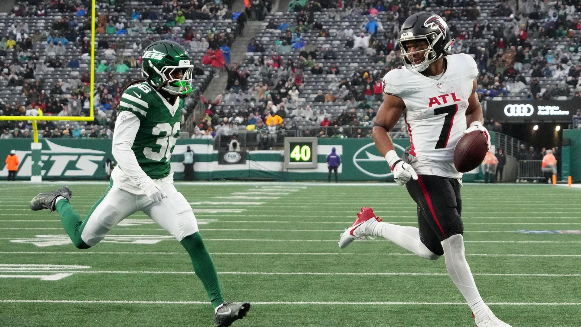
I was shocked at how much I enjoyed this matchup when I saw it pop up on RedZone. It was a gross and rainy day in Metlife stadium, but each team wore their Sunday Best. The Jets’ green/green/white/green is their best look, but it was washed out by the rain. With it being such an overcast day, there was only so bright those uniforms could be in the rain.
The same could be said of Atlanta. Their black/white/black/white is as good as you could ask for, but the rain softened the pop it could have had. Again, there’s only so good the Falcons can get, so we can’t expect much. The weather hurt this grade more than the uniforms.
Grade: Good-ish (would have been Quite Solid if it was sunny)
49ers 26, Browns 8
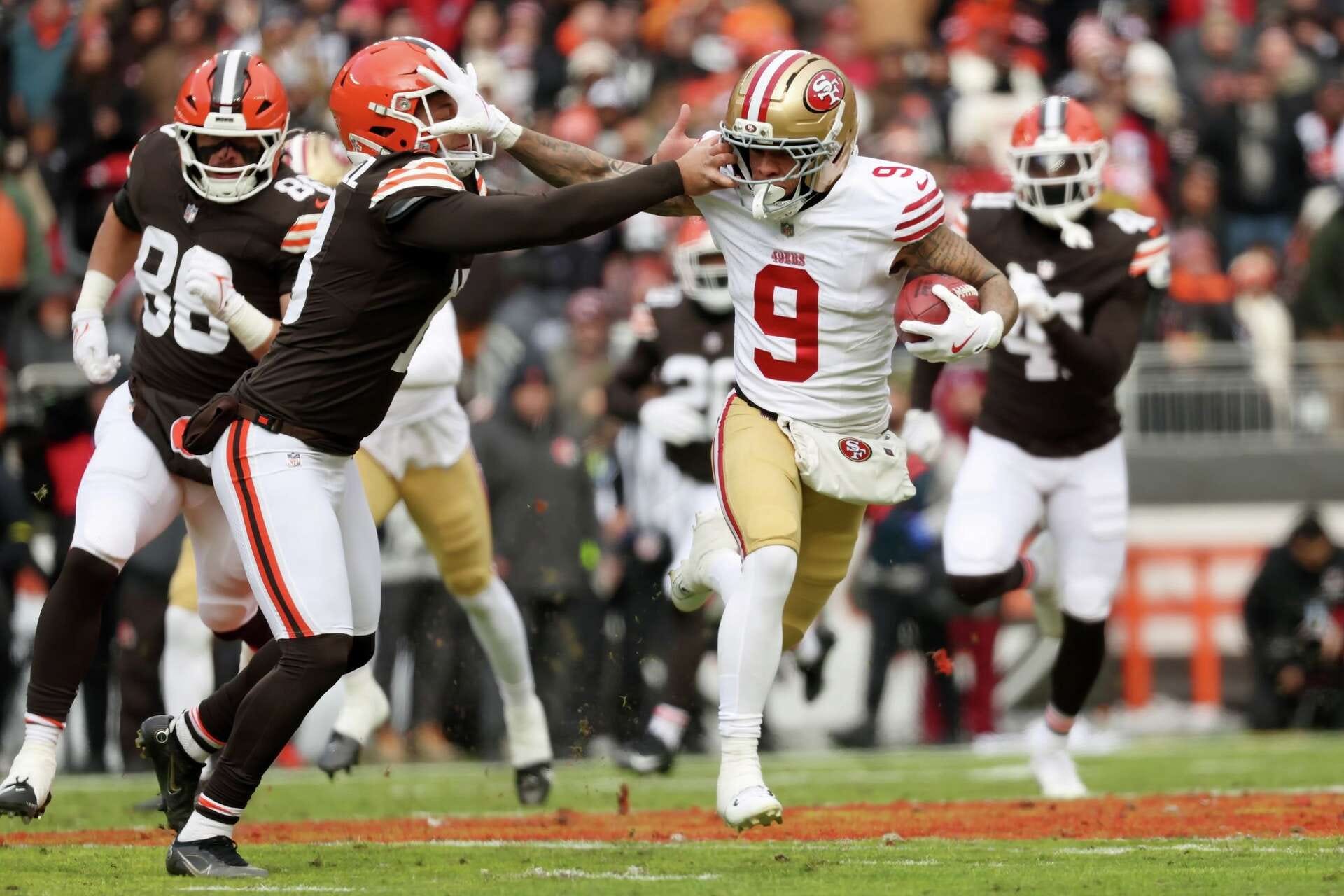
I feel like a broken record. This was yet another game in which it could have been Absolutely Gorgeous, but one team inexplicably goes with a white uniform element. Why would the Niners do this when they could do this?
The Browns looked sharp in their orange/brown/white/brown. It would have complimented San Francisco perfectly had the 49ers worn their red socks. However, since San Francisco DID go with white socks, the Browns should have countered in their orange pants. Oh well. Too many miscues in this game that could have been solved with a simple change of socks.
Grade: Good-ish
Panthers 31, Rams 28
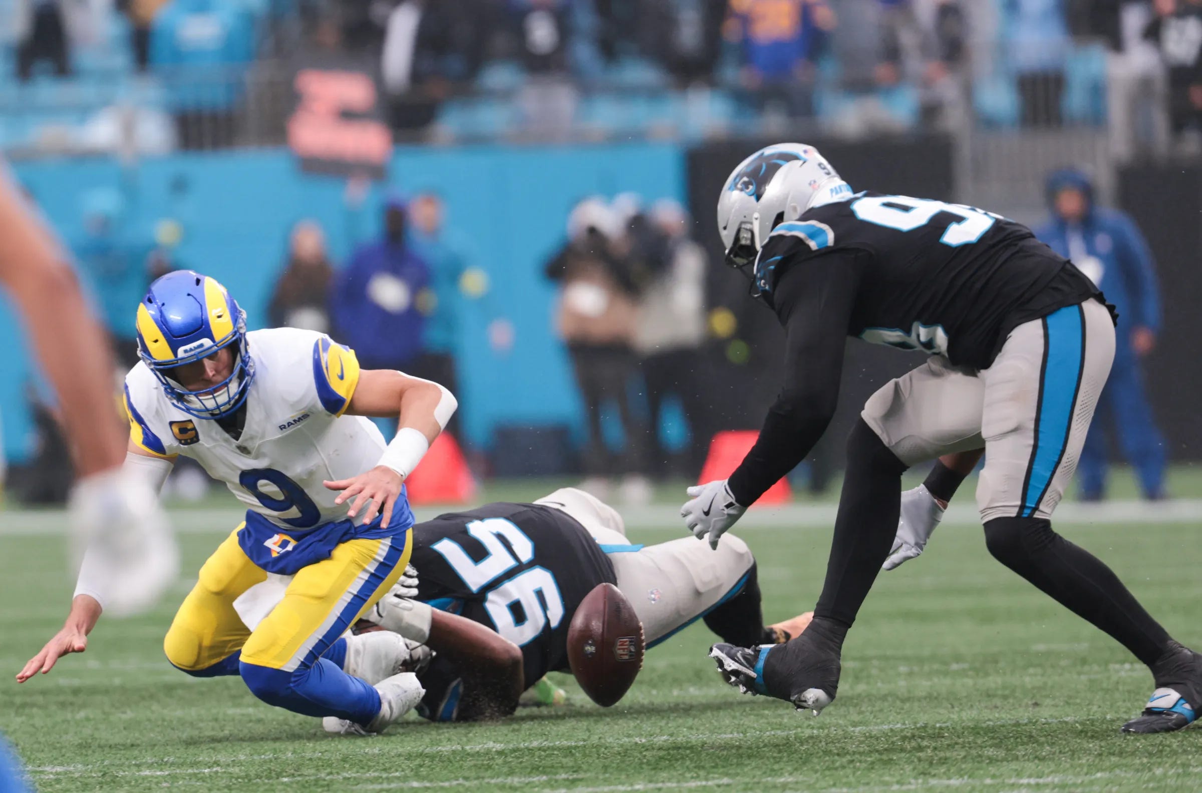
In another sloppy weather game, the Panthers and Rams both wore their respective Sunday Best. Too bad it was such a rainy and wet game, but it at least made it an interesting game, with Carolina upsetting the NFC frontrunner.
As I have said before, I applaud Carolina for trying new uniform combos. They made the 90’s era uniforms feel fresh. However, they got it right the first time with their silver/black/silver/black. That was their classic home combination from their second year (1996) and on, and it just feels right.
The Rams looked great, but those highlighter pants were looking more banana-y than the Sol color it’s supposed to be. The outside stadium and pouring rain added a bad shade to those britches, which was unfortunate, cause they’re usually the best part of the Rams’ uniform.
Grade: Quite Solid
Jaguars 25, Titans 3
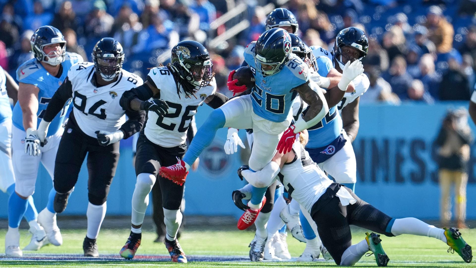
This game is an example of the whole not equaling the sum of its parts. The Titans navy/light blue/white/light blue is their best combo, so I’m glad they’re wearing it (seemingly) exclusively as their home combo. The Jags black/white/black/white is as boring as boring could be… but it’s not mono! So I have to give them credit for that one.
But combined, both uniforms are kinda meh. There’s nothing exciting about this matchup, especially in the bright Nashville afternoon sun. The Titans always look slightly washed out on the TV when they wear these at home during the day, and I bet the Titans fans would like their season to be washed away as well…
Grade: Meh
Buccaneers 20, Cardinals 17
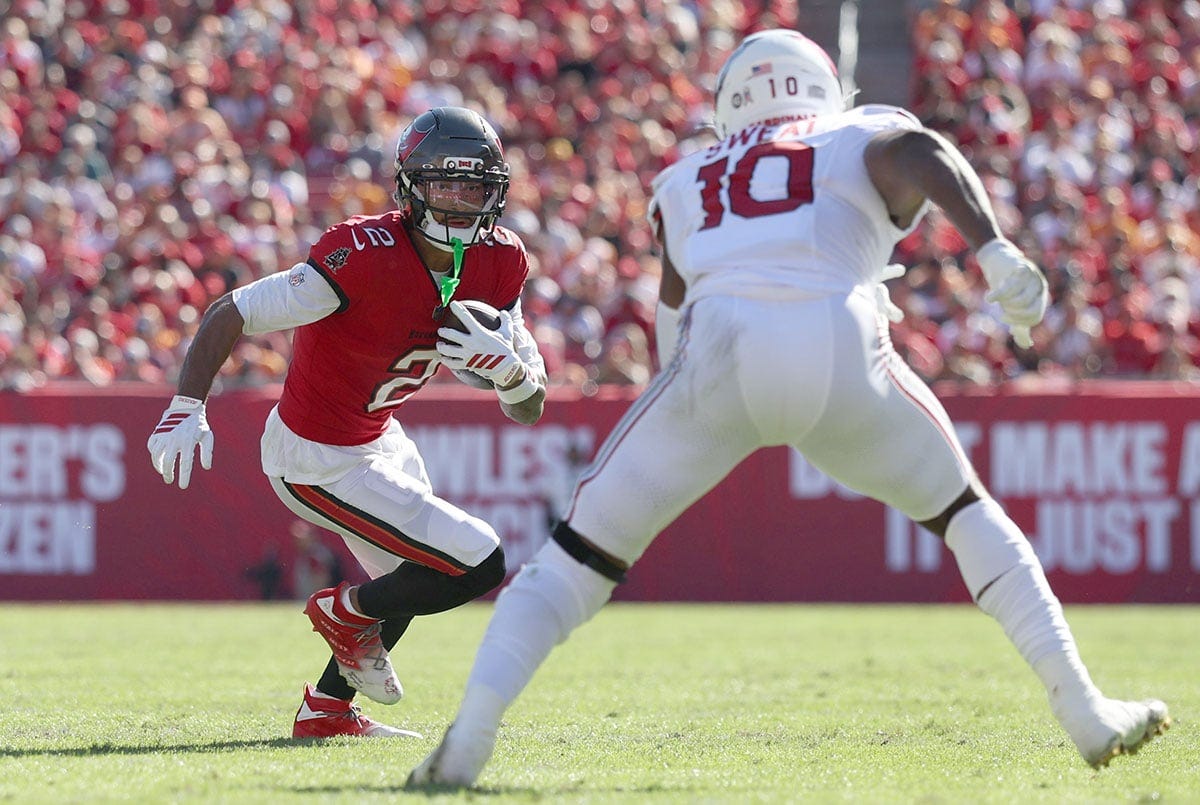
After not wearing their pewter/red/white/black combo more than once a season since they’ve returned to their classics in 2020, the Bucs have now broken them out two weeks in a row! I’m always glad to see this look, but unfortunately, it had to come against the mono-white Cardinals. The pewter pants would have played a huge effort into turning this game into a good one, but, just like so many games this week, 5 elements being white was a net negative.
The Cardinals are committed to going mono, and again, their all-white look is their best of the mono-combos they have, but it did not react well to the shiny day in Florida. Blindingly white is not a good look for late November.
Grade: Try Again
Seahawks 26, Vikings 0
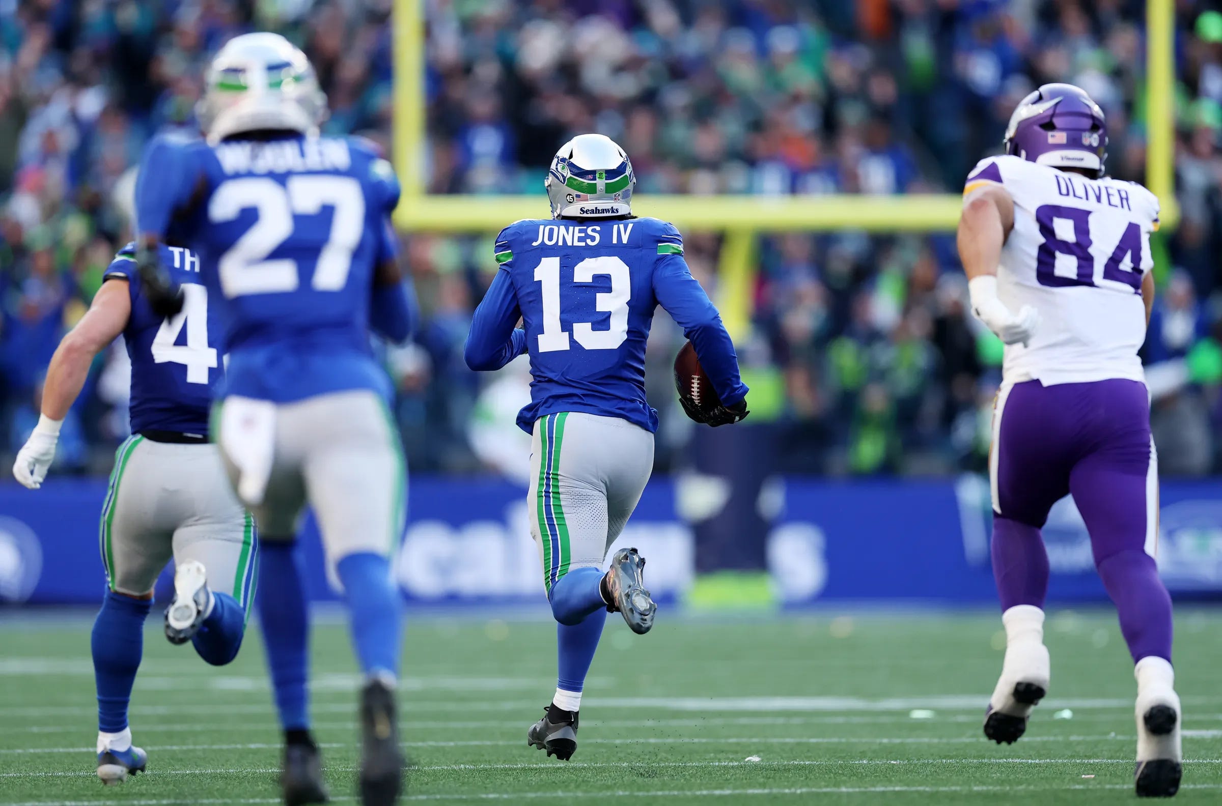
The Seahawks broke out their gorgeous 1980’s era uniforms, which are always a sight for sore eyes. One of the best looks in the NFL was unlocked in 2023, and I’m very glad they exist. They’re very popular among Seahawk fans, and it seems like they are leaning toward rebranding using this template and modern colors. That would be my preference, but we’ll have to see what happens in the offseason.
The Vikings wore their standard away setup. I’ve never really liked the mono-purple below the waist, but it’s their look now, so they’re owning it. Just like Seattle, if they go back to their throwbacks full-time, it would be an upgrade, especially with yellow socks.
Grade: Absolutely Gorgeous
Bills 26, Steelers 7
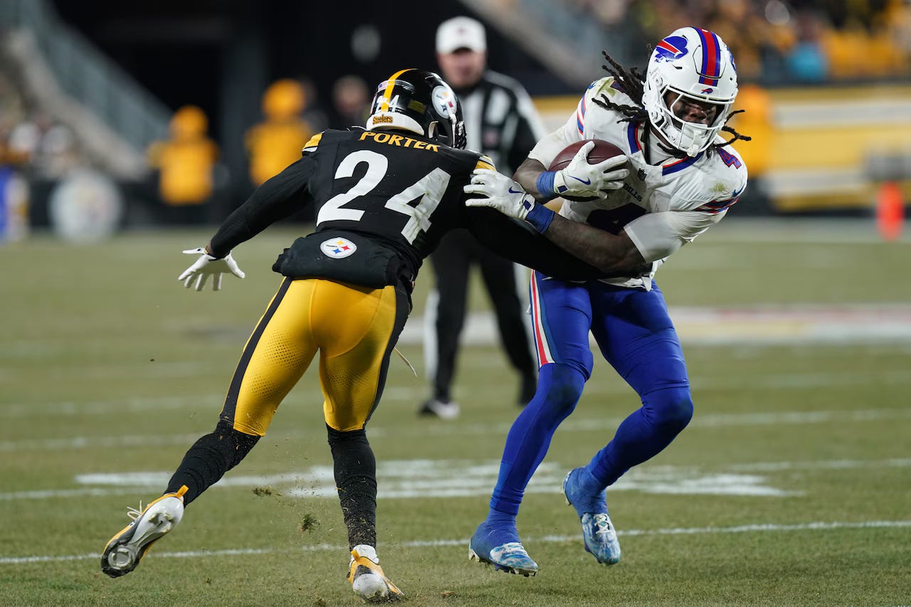
The AFC matchup made me feel cold as I was sitting on my couch. It was a good looking duel, and definitely looked like a November football game. Acrisure Stadium under the lights in the cold is normally a top-10 sports environment… It didn’t quite play out that way this week for Pittsburgh though.
The Steelers in their Sunday Best are perfect. Keep doing what you’re doing, especially under the lights. However, for as many teams that ruined their look by adding one too many white elements, the Bills ruined their look by taking away their white socks. I saw “ruined” with sarcasm, as they’re still beautiful uniforms, but slightly worse. Just like Minnesota, they’re starting to make this their preferred look, but mono-blue britches definitely makes the players look slower.
Grade: Quite Solid (would have been Absolutely Perfect with Bills in white socks)
Chargers 31, Raiders 14
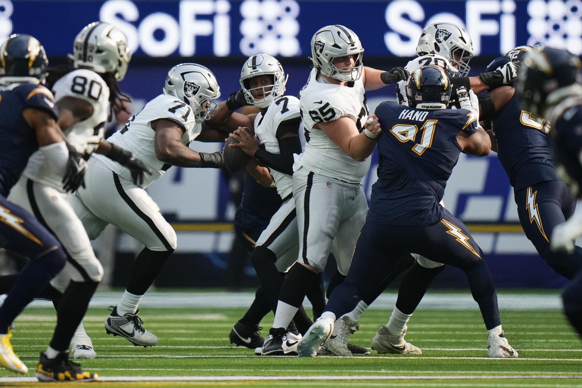
AFC West matchups are almost always lookers. Each team has such a distinct color scheme that it’s almost impossible to have a bad matchup… except this one. For as much as the Chargers’ fans were clamoring for these “Modern Throwback” look, it was never better than their current primaries. Charger Blue is such a better color than these navy ones, and especially when it’s mono-navy.
The Raiders did their job, wearing their classic away uniforms, which is almost always a perfect compliment to the rest of the AFC West… almost. It’s hard to make Sofi Stadium gloomy, but somehow this uniform matchup did just that.
Grade: Groady (all thanks to the Chargers)
Broncos, Commanders
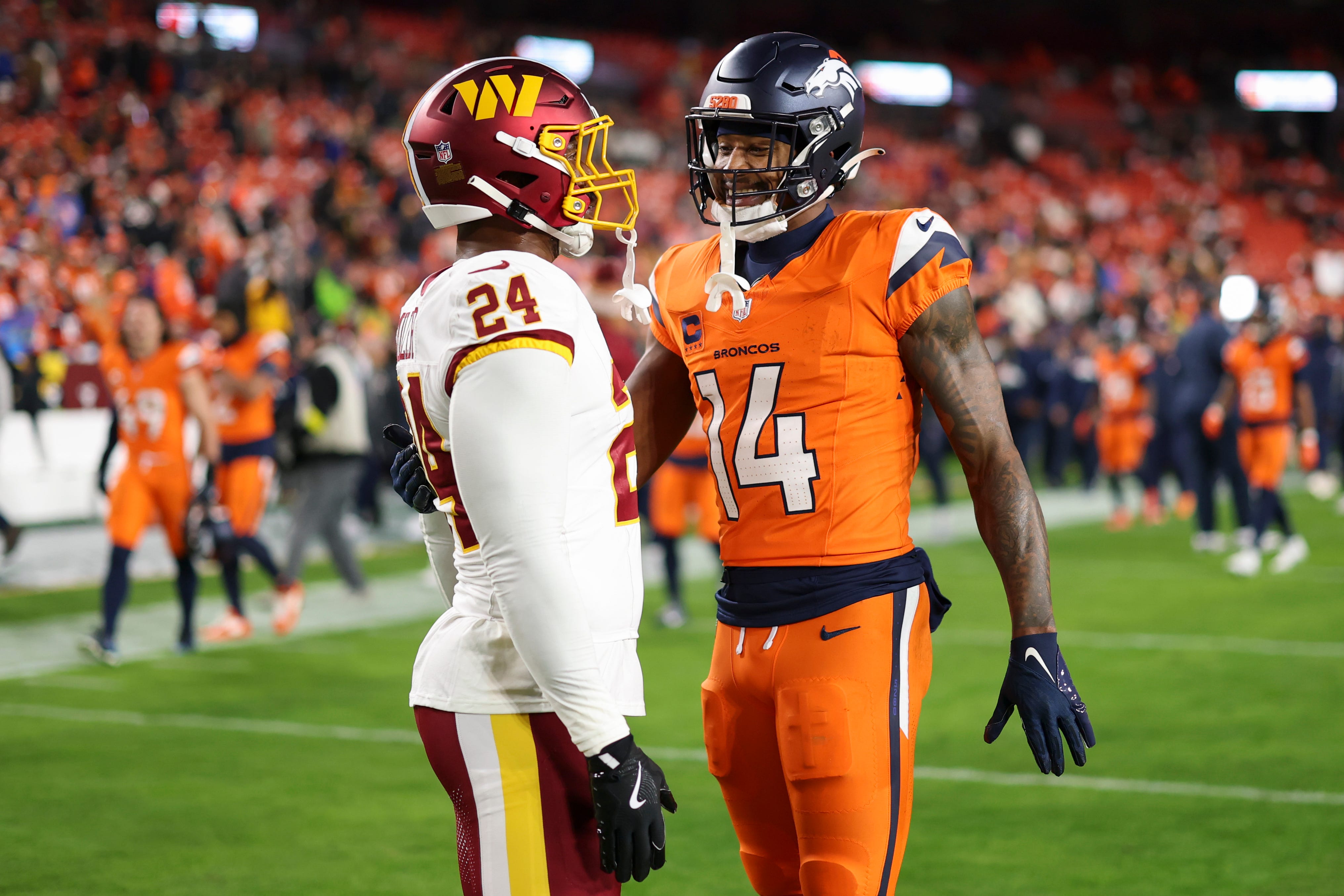
The Sunday Night game ended with an interesting combination, as the Commanders wore their “Super Bowl Era” uniforms against the Broncos in navy/orange/orange/navy. I applaud the Commanders for wearing their best uniforms on the biggest stage, as this is the second straight Sunday Night Football game they have hosted in these uniforms. They looked great, as they always do. The fans, and most with eyes, are counting down the days until they go back to these uniforms full-time.
The Broncos orange jersey and pants isn’t a bad look of theirs, but against Washington, it was too much. Wearing all that orange against a blue, black, or purple team would be fine. There is too much red/orange/yellow hue in the Commanders burgundy and gold for the Broncos to break those out. Against an inferior uniform opponent, perhaps, but the Commanders uniforms demanded a bit more respect than the Broncos gave them.
Grade: Good-ish (Washington doing a lot of heavy lifting here)